Right now I am in Salt Lake City participating in the SNAP conference. I am no joke over the moon, school girl excited to be here! I am about to meet all my favorite bloggers and some soon to be new favorites I’m sure. There was a lot of planning and prepping that went into this little endeavor (hello three small kids!), but I am here. One of the exciting parts about this conference is the opportunity to meet a lot of the brands and companies that I would LOVE to work with (I’m looking at you Home Depot). I created a media kit a few months ago and normally I email the PDF to interested companies, however that wasn’t going to work for meeting people face to face. I thought about printing off my 1 page media kit and then putting it in pretty envelopes to hand out, but something about that didn’t seem quite right. Then I had a dream, not a MLK Jr kind of dream, but a dream about the perfect portable media kit.
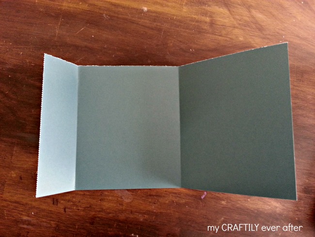
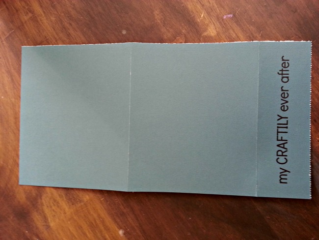
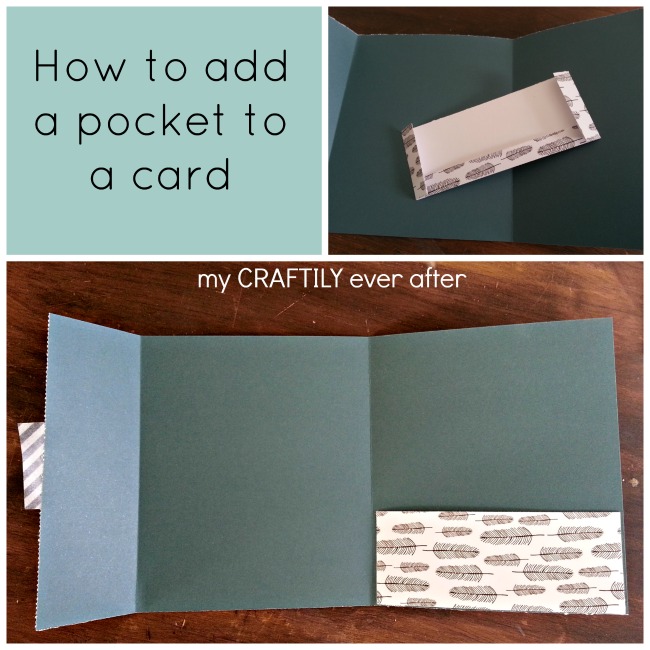
It started off with a cardstock folder and progressed with the addition of a pocket. It then took a drastic turn toward wedding invitation, but I feel like I reigned it back in at the last minute by adding some fun touches. I wanted to make these as budget friendly as possible so I searched through my craft supplies to see what I had already on hand. I pulled out some pretty 12×12 scrapbook papers, washi tape and glue. I started off my cutting my solid colored papers in half creating 6×12″ strips of paper. I then scored it at 5 inches and 10 inches to create a three part portfolio.
I knew that I wanted my blog name to be printed on the outer fold so I created a Word document the same width as my paper (6 inches) and added my name upside down across the top. I printed it off on regular paper first to make sure it lined up just right and then fed my cardstock sheets through my printer one at a time.
I then used some of the fun Amy Tangerine paper from this post, and cut it into 6×2 1/2″ strips. I then scored 1/2″ on three sides (leaving one of the long sides untouched). I folded the scored parts under and applied glue to each of the flaps. I attached it to the right hand side of the card and then let it dry.
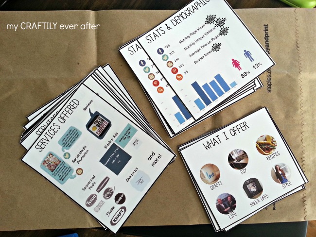
While the glue was drying I created the inserts. I knew I wanted my introduction to be front and center when you opened the card and then I wanted all the numbers, services and content to be staggered on the right. I created a Photoshop template for each spot and started transferring my information over. Once they were ready I printed off a test set to make sure nothing needed changing and then sent the final copies over to Staples to be printed on a heavier weight paper with their fancy laser printer. I used their paper cutter (mine is SO dull right now) and had all my pretty cards ready to go in no time!
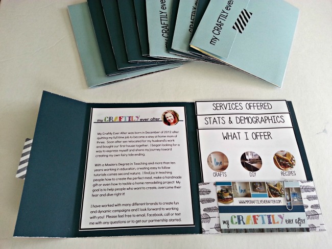
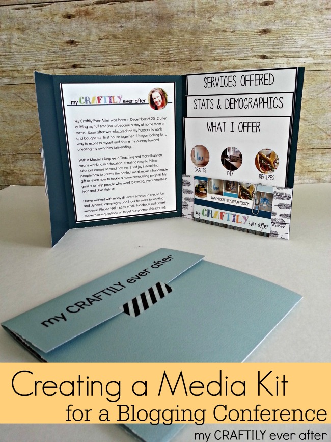
 Then it was time to assemble! I simply stacked the three inserts and slipped them in the pocket on the right. I paper clipped a business card to the outside of the pocket, because it doesn’t do any good if I forget to tell them how to get in touch with me! Lastly I glued the introduction page to the middle and sealed the whole thing up with a piece of washi tape.
 Since this is my first blogging conference I’m not sure what to expect, but I will be prepared! Hopefully these bad boys do the trick and opens the door to further conversation! Have you ever been to a blogging conference? Did you bring a copy of your media kit? Was it worth it?

I’m so curious how your media kit was received with brands at the conference! I’m heading to my first conference this weekend and am realizing a little too late that I have no idea what I should be taking with me. I love your creative approach.
I absolutely LOVE this idea! I’ve just recently started my own blog and I was doing a little research, and trying to decide if it was time to start making my own media kit, when I stumbled upon yours and decided it was perfect for me! I feel like your idea for a media kit will stand out among the thousands of others out there. I just wanted to say thank you so much for sharing your fantastic idea with us!
I will admit I have never seen a media kit for blogging before, but I LOVE your layout! It’s simple and clean and full of personality. LOVE IT!
I am so excited for you!!! Have a fabulous time.