In case you missed parts 1 and 2 you might want to click over and read those first. Or maybe you like starting in the middle, either way is fine with me!
The first thing I want to tell you is kind of my “dirty little secret” so you have to promise not to judge, okay? Every single photo you see on my blog was taken with my cell phone. I’ll let that sink in. Yes, all of them. Even the good ones. Especially the crappy ones. One thing I have learned over the years is that photos will make or break you. You can be an amazing writer, a real wordsmith, but if your posts are accompanied by dark or blurry or grainy photos, you aren’t going anywhere. Now here is where I preach about the benefits of buying a DSLR camera. Seriously, you should. I was so extremely lucky to have a friend of mine give me hers when she upgraded (I love you Rebecca), and now I just need to learn how to use it. But that’s one of my goals for this year, and really you might want to make it one of yours too.
“HERO” Images
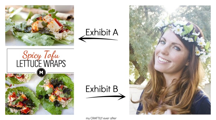
When it comes to blogs and photos I always hear people talking about hero images or hero shots. This is fancy marketing speak for the big beautiful photo at the beginning of your post that tells the reader with one look what your entire post is all about. It usually has words on it. It should ALWAYS have your logo on it. A great hero image can take an otherwise mediocre post and make it go viral on Pinterest. Let’s compare. In Exhibit A it is clear that you are going to learn how to make Spicy Tofu Lettuce Wraps. There are beautiful, bright, clear photos and a description that doesn’t take away from that. In Exhibit B we have a lovely lady, but what am I going to get if I click on that image. Photography tips? Hairstyle post? Flower crowns? Life in general? I don’t know, because she isn’t telling me. Keep scrolling…

PicMonkey
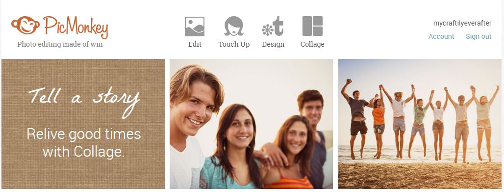
I have fallen in love with the online photo editing software, PicMonkey. It is super simple to use, doesn’t cost an arm and leg to upgrade to the premium version and you can use it anywhere you have internet access. It really doesn’t get much better than that in my opinion. With PicMonkey you can edit your photos exposure and saturation, straighten and crop, add layers, filters and even text. Really there is not much you can’t do with it. It’s an easy program for getting your feet wet with photo editing, and a small investment while you wait for your site to start making you some money.

Staging
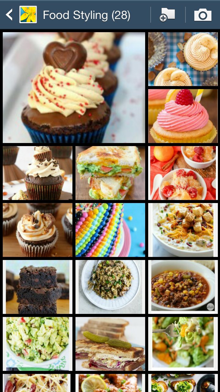
One of the most important things to figure out after you learn how to edit your photos is figuring out how to set the scene. Now sometimes the less is more approach is all you need. A clean crisp background with your project or recipe featured up close and personal gets the job done. However, sometimes you need a few extras to help seal the deal. Maybe a napkin and fork next to your dish, or a few carefully scattered supplies in the background. Look at other bloggers pictures that appeal to you and see what about it is that you like. Make a list or keep a secret pinterest board or screen shot these things so when it comes time to stage your own photos you have your own reference book.

Supplies
So now you know you need some photo staging props, but where do you go to get them. I’m a huge fan of picking random dishes from thrift stores. Now when you are staging photos you want to go smaller than bigger. You want your item to take up the majority of the frame, not your plate or any other props. Most of my recipes are photographed on either large saucer plates or small salad plates. I love jars for salad dressings and drinks and they can be picked up for about a quarter each.
Now sometimes there are things that I know I can’t find at the thrift store or that I am looking for for a specific post. My go to place for these items is Pick Your Plum. I love that site. So no joke I have to avoid it like the plague because I can drop at least $30 every single day if I’m not careful. So I try and look only if I’ve got something specific in looking for. You can go every day and check out the new items, but don’t say I didn’t warn you…
Sizing
The old saying, “A picture is worth a thousand words,” only works if your pictures are big enough to be seen. The ideal size for blog post images is the same wish as your post. You can figure out what this size is by checking your stylesheet. Scroll down until you see something about post structure, skim around until you see a big number in px. If you can’t find it or don’t want to mess with looking, anywhere from 600px to 750px is generally a good size. Now when you save your images you can save them at that exact width and you won’t run into slow loading times while they try to download HUGE photo files, and you won’t have people squinting to see what you did!
Don’t forget to go back and read parts 1 and 2 if you didn’t already. And come back soon for part 4!


